Ikat Prints, Eyelet Fabrics, and Graphic Florals At Timo Weiland Spring 2014 Runway Show


When creating their Spring 2014 collection, Timo Weiland designers Alan Eckstein and Timo Weiland assembled a mood board that displayed images cobbled together from their Instagram feeds, which the duo felt had properly documented their daily comings and goings. Perhaps because of the innately vague quality of their source of inspiration, the narrative presented during their Spring 2014 runway show felt more like a stream of consciousness work, impulsive and unfiltered, as opposed to a nuanced tale with a distinct point-of-view. Which is not to say that the clothes weren’t pretty — many of the looks were exquisite — but, as a whole, the collection felt a bit muddled and spasmodic.
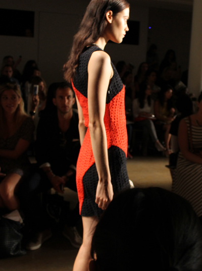
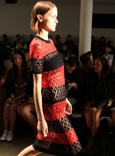
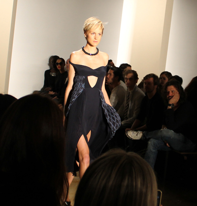
The first few looks seemed to tell a strong graphic tale. There was a sleeveless, white knit dress with horizontal navy stripes along the bodice and, right below the waist, a fun navy-and-white checkerboard pattern. For a moment, this strong tale was interrupted by the introduction of two ho-hum looks — both incorporating grey striped linen fabrics that felt like they belonged in a farm (the models wearing straw hats did not help matters much). But soon, the meandering came to a halt and, once again, we were presented with looks that felt easy and relaxed but also had a strength to them: the red-and-black “Carrie” eyelet dress, for instance, was color-blocked so that each block of color was angled, creating a more dynamic effect than the standard horizontal or vertical blocks of color we’ve been seeing for several seasons now; and the open stitch knit “Milla” midi dress, shown third above, was one of the most commanding looks in the collection.
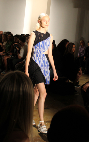
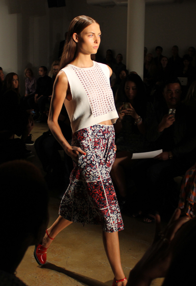
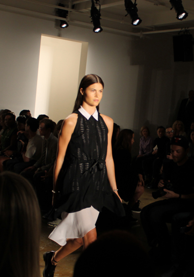
Eyelet fabrics plaid a huge part in the collection and most of the looks incorporating them were quite successful — in part because Timo Weiland’s use of eyelet fabrics was itself so dramatically different from the dainty patterns we associate with tablecloths, napkins, and garden party dresses. The designers’ eyelet fabrics simply consisted of row after row of round perforations — not arranged to create floral patterns or used on scalloped hemlines but, instead, worked into roomy slacks and paired with white crepe to create relaxed but crisp blouses (as in the look pictured fifth above), used for crop tops and playful A-line skirts (as in the look shown sixth above), and generally integrated into garments to add a sense of lightness and breathability. Even someone who typically shudders at the sight of eyelet (yours truly) would feel magnetized by these fabrics since there was an edgy undercurrent to them that made them anything but prudish or fussy.
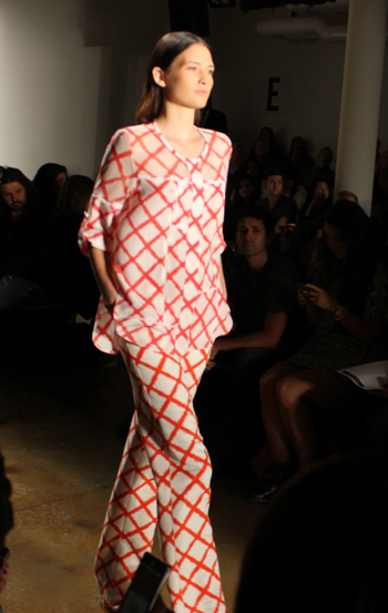
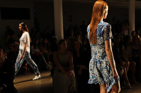
An ikat print creating a diamond cagework motif was used throughout the collection, but was way more striking in its white-and-red iteration than its turquoise-on-navy counterpart. The “Tabitha” dress in this red-and-white ikat print, shown second above, was one of the prettiest, perkiest looks in the collection, fusing together the Bohemian vibe of ikat textiles with the lightness and preppiness of eyelet and presenting this unique combination in a sporty dress with a banded waistline and a pleated skirt that added a sense of movement. Similarly, the ikat print “Giovanna” blouse and “Rori” pants, shown seventh above, conveyed a relaxed, resort-ready vibe that somehow could work in a tropical setting or a city landscape.
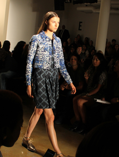
Towards the end of the show, floral prints were introduced, with varying degrees of success. When incorporated into structured garments like slim-fitting jackets (as shown third from last above) or into overly sporty looks like a pair of silk pants with a T-shirt that looked like sleepwear, the effect was lackluster. But when the floral prints were used for breezy skirts and short-sleeved silk dresses, they added a splash of colorful energy. Because they had a graphic quality to them (the buds were divided into blocked sections), the floral prints didn’t feel dainty — even in the most feminine of garments — which I personally loved. I was particularly fond of the look shown first above, consisting of a white nylon-rayon knit shell top with a cropped waistline and eyelet fabric along the center panel paired with a below-the-knee red floral print skirt .
Overall, despite a few missteps, the Timo Weiland Spring 2014 collection was rife with garments that felt easy but edgy — exactly what every downtown girl covets.