Givenchy Makeup Spring 2012 — Poppy Reds And Perky Pastels
Though most laypersons associate 19th century artist Claudet Monet with his beautiful water lily pond paintings, the French Impressionism pioneer derived inspiration from many of nature’s wonders — in fact, while living in Argenteuil from 1873 to 1878, Monet turned his attention to the rural landscapes around his domicile, producing a series of oil canvas paintings capturing the expanses of grass covered with bright red poppy blossoms. The first poppy-centric painting, 1873’s “Poppies” oil painting remains one of the most well-known paintings in the world, as does 1875’s “Poppy Field, Argenteuile,” which Monet completed during a summer in Gennevilliers. Other notable works include 1886’s “Poppy Field” painting and 1890’s “Oat and Poppy Field, Giverny” painting. It was with Monet’s paintings in mind that Givenchy Le Makeup Artistic Director Nicolas Degennes developed the vivacious red lip, blush, and nail colors in the Givenchy Makeup Spring 2012 collection, available exclusively at Sephora.com.
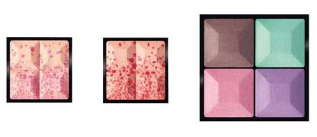
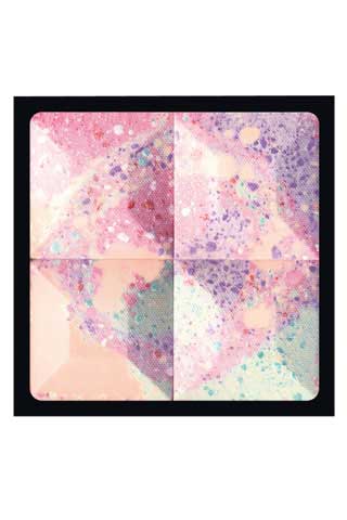
The season’s Sephora.com ($56 at Sephora.com), meanwhile, nods to the pointillism technique utilized by Neo-Impressionism artists like Georges Seurat and Paul Signac, with dots of bright pink, deep lilac, golden yellow, and jade green accentuating a swirling palette of softer versions of these four shades that recall such other French Impressionism works as Edouard Manet’s Banv “Bench” oil painting or still-life paintings like his 1882 work “Lilacs in a Vase.”
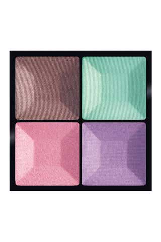
The Sephora.com ($57 at Sephora.com) incorporates three punchy pastel shades — a medium-toned lilac, a refreshing seafoam green, and a bright peony pink — pairing these with a red-toned brown.
As a whole, then, the collection conveys romance in all its forms — from dainty pastels to ravishing scarlet tones.
But how does each product perform? After the jump, we’ll break down every single offering in the Givenchy Spring 2012 makeup collection, show you swatches of the various shades, and discuss how each makeup piece performed and whether it’s a must or a bust.
GIVENCHY LE PRISME EYESHADOW QUARTET IN BUCOLIC BLOSSOMS
If one product is likely to catch your eye in this collection it’s the Sephora.com ($56 at Sephora.com). The reason: the eyeshadow quartet feels perfectly on trend with its clean pastel hues. Though pastel tones can sometimes feel dated, like vestiges of the 1960s or of 1980s Jane Fonda workout gear, these romantic shades look modern and fresh, ladylike in a contemporary sense.
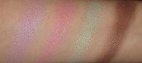
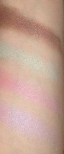
Below, you’ll find swatches of all four shades in the palette. The lilac hue and minty seafoam green are particularly stunning. Just see for yourself:
In terms of texture, all four shades feel exquisite on the skin — moist and velvety smooth. They also have a rather nuanced satin finish, sprinkled with micro-glitter bits. The pink, for example, looks like an almost sheer wash of rose color that’s intensified with brighter magenta micro pearl particles. Similarly, the watery seafoam green hue appears rather sheer at first, but twinkles marvelously thanks to the shimmering, multi-dimensional emerald green pearls.
The pastel hues look demure and ethereal, so that you can simply brush them atop lids for a hint of opalescent color. Now here’s the one caveat: if you’re looking for intense pastel eye shadows, these may not be ideal. Sure, you can layer the color to produce greater intensity or use a moist brush when applying to increase the colors’ depth (a technique I’ve used when wearing the colors), but even these approaches will only go but so far. Still, it’s hard to resist the seafoam green and lilac hues.
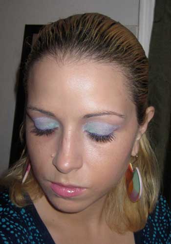
Below, you’ll find a sample look I created with the Le Prisme Eyeshadow Quartet in Bucolic Blossoms.
To create the look, I started by applying the light pink hue all over lids, brushing the hue up to the brow bone to create a solid base. Next, I applied the soft lilac eye shadow to my lids, concentrating on the area beneath the crease. Since the shadow still looked so understated, I reached for a flat eyeshadow brush, moistened its bristles and piled on the color, applying the damp pigment onto the lids to intensify the color.
Next, I brushed on the seafoam green hue, moving from the inner corners to the middle of lids and blending the two shades together. Again here, I relied on a damp brush — particularly when working along the inner corners of eyes.
Last, I applied the NYX Cosmetics Slide On Pencil in Pretty Violet along the lash line and layered the NYC Slide On Pencil in Pink Suede atop it, finishing off with two coats of Lancôme Doll Lashes mascara.
Check out the look:
———- ———- ———-
GIVENCHY LE PRISME VISAGE BUCOLIQUE
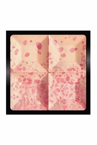
The Sephora.com ($56 at Sephora.com) incorporates four shades — a pale but sunny yellow, a cool violet tone, a light teal-ish green, and a warm rose. These color inlays are arranged in such a fashion as to resemble a watercolor painting, with sheen-packed pigment dots adding a hint of luminosity.
Because these shades represent the four key points in the color wheel, together they create a harmonious effect, balancing out any complexion problems (from dark crevices to red inflammations). When you brush the powder atop your face, the result is a wash of matte color with a hint of dewy radiance — all of which will make you feel like a freshly-picked flower.
———- ———- ———-
GIVENCHY LE PRISME BLUSH BUCOLIQUE IN 1 BUCOLIC ROSE AND 2 BUCOLIC POPPY
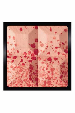
As with the Givenchy Le Prisme Visage Bucolique powder, the Sephora.com ($49 each atSephora.com) feature abstract splatters of deep color against a softer backdrop. The Le Prisme Blush Bucolique in 2 Bucolic Poppy is perhaps the best example of how Monet’s poppy paintings influenced the collection as bits of coral-meets-scarlet red are splatted along a softer coral pink hue.
Here’s a swatch of the Givenchy Le Prisme Blush Bucolique in 2 Bucolic Poppy. This particular blush produces a nice flush, as if cheeks had just been pinched.
———- ———- ———-
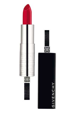
GIVENCHY ROUGE INTERDIT IN 54 BUCOLIC POPPY
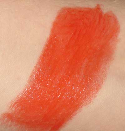
While I am typically obsessed with Givenchy’s lipsticks,I found the Sephora.com($30 at Sephora.com) to be one of the low points in this collection. Rather than a robust, full-bodied red, this lipstick has a sheer, glaze-like finish that feels non-committal. My sense is always that, if you develop a red lipstick, you should do so with gusto, producing a sumptuous, rich, full-coverage product. The Givenchy Rouge Intedit in 54 falls short of this mark, then, since it’s so incredibly sheer.
The vermilion color has orange undertones, so that it looks like a tomato sauce hue — not a particularly flattering shade to have on the pout. Below you’ll find a swatch of the lipstick hue:
———- ———- ———-
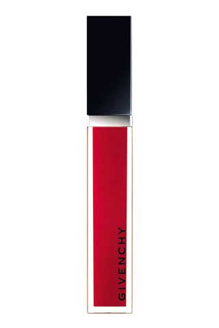
GIVENCHY GLOSS INTERDIT IN 32 BUCOLIC POPPY
The Sephora.com($27.50 at Sephora.com) is much closer to the type of red I was coveting. This gloss offers an amazing amount of coverage for a gloss and its high shine finish is beyond alluring. Again, the color has warm undertones but it features the type of intensity you associate with poppy flowers, making it truer to the collection’s inspiration.
Here’s a swatch of the Gloss Interdit 32 shade:
Here’s a photo of me wearing the Givenchy Gloss Interdit 32:
———- ———- ———-
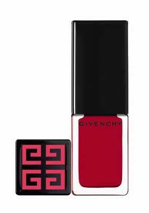
GIVENCHY VERNIS PLEASE! NAIL LACQUER IN 177 BUCOLIC POPPY
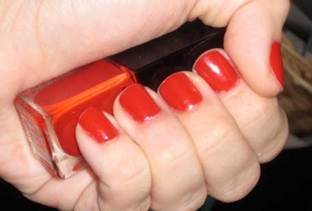
The Sephora.com($17 at Sephora.com) is quickly becoming one of my go-to red polishes as it has a semi-transparent quality but can be layered to achieve full coverage. Though it’s fairly easy to find a nice candy apple red (or any blue-base red for that matter), stumbling upon a nail lacquer with warmer, more orange-and-gold undertones can prove to be a challenge and this one hits all the right notes in that department. The shade reminds me of flamboyan trees, of vintage T-birds, and Vermilion flycatcher birds. Plus, the glossy finish will make you feel like the ultimate temptress.
Take a look at the photos below to get a sense of what the color looks like on nails!


