


Former butter London Creative Founding Creative Director Nonie Creme Churns Out Yummy And Affordable Nail Lacquers Via Her New Colour Prevails Line
Nonie Creme is the type of gutsy, witty, intuitive, risk-raking, rock ‘n’ roll cool, business-minded, approachable beauty guru that most of us can only aspire to be. When I first met Nonie backstage in 2009, during New York Fashion Week, she was explaining the nail look for a Vena Cava runway show, a memorable mani she had masterminded using lacquers from butter LONDON, the brand she founded in 2005 and nurtured into a worldwide sensation. Over the years, our paths continued to cross — mainly during Fashion Week — and each time I became even more more enamored with Nonie as both a person and businesswoman. Unlike so many others in the beauty industry, Nonie didn’t bother with silly affectations — she didn’t need personas and pretensions because she had raw talent, smarts, determination, and a very clear vision. And then, a few years ago, I stopped seeing Nonie altogether. Even backstage at runway shows for which butter LONDON executed the nail looks, I now encountered Global Colour Ambassador Katie Jane Hughes — not Nonie Creme. Hughes was bubbly, cordial, warm, and professional in all of our exchanges, but it didn’t stop me from wondering, Where was Nonie? Eventually, I learned Nonie had left butter LONDON and that she was pursuing other ventures. What mystery project had she embarked upon? Well, I’d have to wait nearly two years to discover that juicy tidbit.
In January, news finally broke that Nonie Creme was entering the “masstige” market with a brand new affordable beauty line, Nonie Creme Colour Prevails, available exclusively at Walgreens stores and Walgreens.com. Ever the shrewd businesswoman and courageous pioneer, Nonie had ascertained that, while the prestige beauty market was becoming increasingly crowded, there was plenty of room within the drugstore arena for new and exciting brands. After securing TPR Holdings as an investor, she developed a full cosmetics line replete with liquid eyeliners, eyeshadow palettes, lipstick/lipgloss duos, CC creams, double-sided mascaras, blush/bronzer duos, and — you guessed it — nail lacquers.
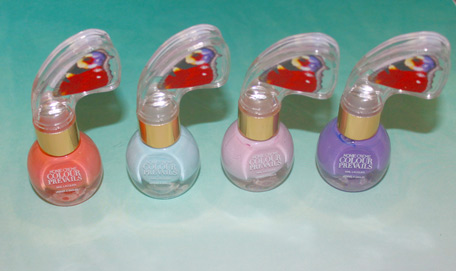
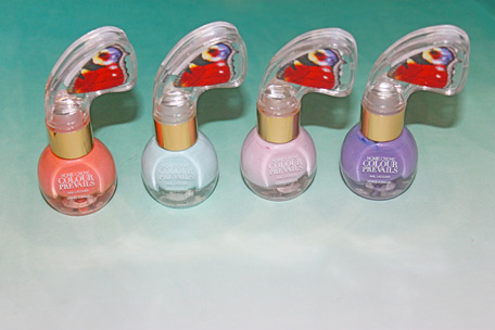
Recently, I sauntered into the nearest Walgreens and spotted a Colour Prevails display so, like any beauty junkie, I proceeded to spend the following 90 minutes tinkering with every single product showcased. Finally, I settled on six nail lacquer shades (four of which are pictured above). Not only did I find the colors stunning, but I wanted to see if Nonie had managed to make lightning strike twice, if she’d succeeded in creating reasonably priced ($8 per bottle) nail lacquers with the same charm, attitude, shine, and longevity that distinguished those in the butter LONDON range.
And she did! Each nail lacquer required only two coats to deliver complete opacity, and each color felt refreshingly unique. Even the bottle’s design is sheer genius — as opposed to traditional nail polish bottles with boring (and often stubborn and difficult to turn) cylindrical twist-off caps, each Nonie Creme Color Prevails nail lacquer bottle features a golden ring around its neck topped with a translucent, ergonomic, butterfly-shaped plastic handle with colorful wing-like motifs on either side. The butterfly motifs were apparently inspired by Alexander McQueen’s “Voss” Spring/Summer 2011 runway show, in which a naked woman was displayed inside a box, her figure surrounded by moths (though to make the concept more palatable to the masses, Nonie opted for butterflies as opposed to moths, which feel darker and more funereal). Not only do the butterfly wing motifs pop out in any drugstore cosmetics aisle, they also serve a purpose: because of each lacquer’s unique handle’s shape, it’s easier for women to apply pressure to different points and leverage said pressure in a way that ensures the cap twists off with ease. While this may seem like a small detail, it’s actually incredibly handy — after all, how many of us have accidentally smudged a nail while trying to close a nail polish bottle, our finger clumped together along the cap’s tiny flat surface? This handle literally makes the painting process easier, as does the wide brush, and that alone makes these polished worth the investment,
Now, let’s get to the fun part: colors and swatches! I’ve already tested out four of the five shades I purchased: Sashimi, a salmon pink with a cheeky personality; Girl’s Club, a grape-y violet; Cry Baby, a whitened baby blue that feels fresh rather than nursery-worthy; and Shy Guy, a whitened lilac pink reminiscent of soft cherry blossoms.
Let’s check out pics of every shade, shall we?
SASHIMI
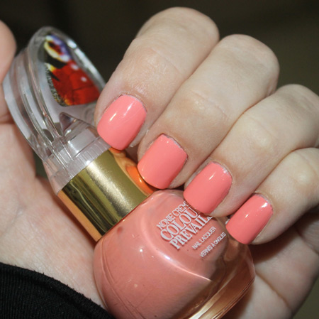
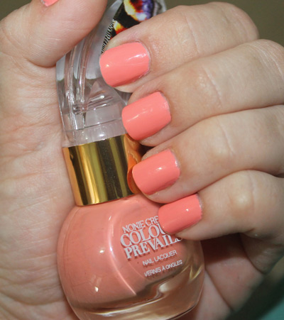
Admittedly, I eat more sushi than I do anything else (well, aside from soup!), so the name of this nail lacquer pounced at me right away. I loved that Nonie managed to maintain some of the wit and irreverence in the Colour Prevails product names since it has always been one of my favorite things about butter LONDON (product names do, in fact, go a long way in conveying the personality and ethos of a particular brand to the buying public). Moniker issues aside, the color has a slightly retro ’60s vibe (think of the salmon-colored chairs in one of the scenes in the original 1960s caper film Ocean’s 11, starring Frank Sinatra, Dean Martin, and Angie Dickinson) without feeling dated. There’s a clean, crisp quality to the tone, and a decidedly pink base that makes the color feel like a new neutral rather than a vestige from eras past. It’s perky without being flashy — a great alternative to tired powder and honeysuckle pinks.
GIRL’S CLUB
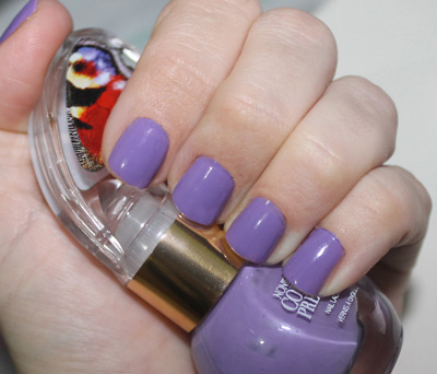
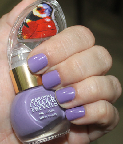
Were anyone to utter the words “purple unicorn,” the creature that would pop into my mind would have a luscious coat and mane in this precise shade. Granted, that might be a result of too many late-night viewings of My Little Pony Friendship IS Magic (yes, I admit it!), but it’s precisely what comes to mind. It’s got a sweet grape candy kick, but it doesn’t feel juvenile in any way — instead, it’s as magical as the lighting and fog in Prince’s Purple Rain flick (in fact, the color looks remarkably similar to the font shade chosen for the film posters).
CRY BABY
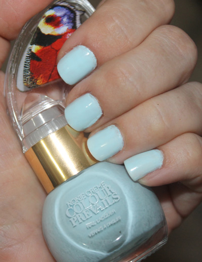
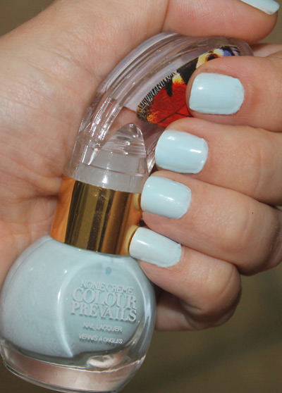
When shopping for blankets for newborn baby boys, you’re likely to find plenty of offerings in a slight variation of this baby blue shade. Because of that association (not to mention the nail lacquer’s own name), there’s an innocence surrounding this creamy, fully opaque powder blue polish. But here’s the fascinating part: because the color has been whitened so much and because it does contain a hint of teal, it doesn’t feel too precious or dainty. It’s celestial, but not necessarily cherubic; tender, but not fragile. It’s like the light blue sky we admire on the sunniest of days, but it has the fluffiness of a wispy cloud.
SHY GUY
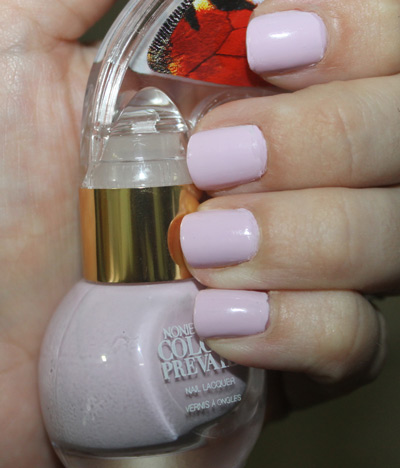
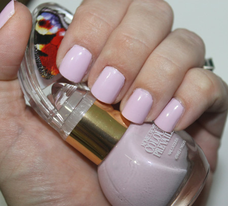
Yet another shade that proves soft doesn’t have to mean boring, the Shy Guy nail lacquer saunters the line between powdery pink and pale lilac, yielding a whitened cherry blossom color that feels perfectly apropos for spring and summer. The balance between the various tonalities here is spot-on, allowing the shade to feel like a nod to nature as opposed to the traditional girly fare dredged out when creating pink polishes (ballet slippers, bubblegum, pink lemonade, cotton candy, strawberry ice cream, and Barbie paraphernalia all come to mind). This is the type of shade a bride could wear to her wedding, but it’s also fitting for the office, a date, the beach, or anywhere you please. This Shy Guy, you see, finishes first!


